What is storytelling?

Storytelling is a concept rather than a specific block or plugin. It combines scrolling with interactive multimedia elements like text, images, and animations, which appear or change as the user scrolls down a webpage.
MediaPress Blocks helps elevate the existing capabilities of FSE with the addition of blocks for animations, charts, image comparison & slider, to help bring the storytelling concept to life.
1. Once the plugin is installed, you’ll see the MediaPress blocks option in the sidebar. From here, you can enable or disable individual modules as needed. For the most engaging and fully interactive functionality, it’s recommended to enable all modules.
2. Depending on the use case or theme requirements, it may be beneficial to create a dedicated template to distinguish between standard, static posts and those that use storytelling to deliver a more immersive reading experience.
The following example shows how the MediaPress blocks can be combined to create a storytelling style article.
Animations
What are animations?
Animations gives an option to add movement to blocks, such as fade and slide in. This adds increased dimension and depth to posts and pages.
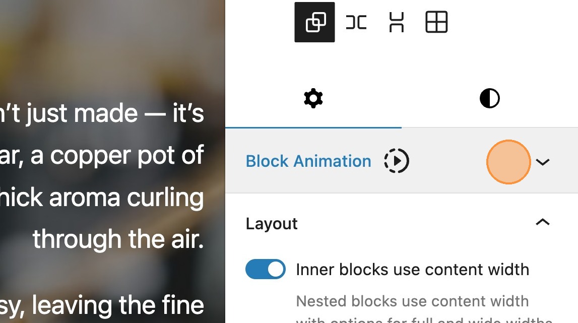
3. Rather than enabling a specific block in the editor, when the animations module is enabled, you will see a block animation panel appear in the editor sidebar.
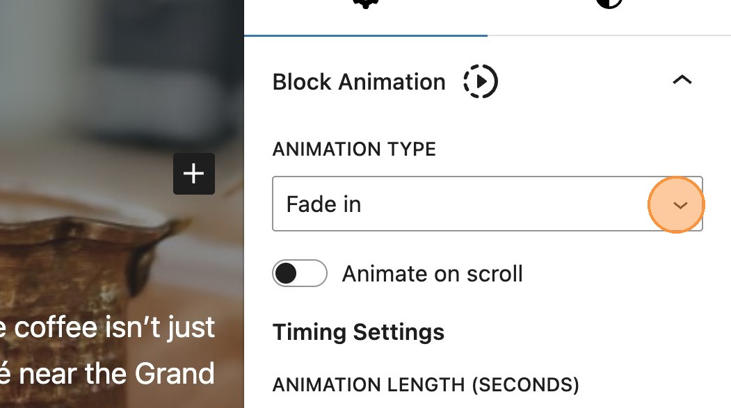
Animation Type
4. There are 3 animation types, fade in, slide in or slide and fade in.
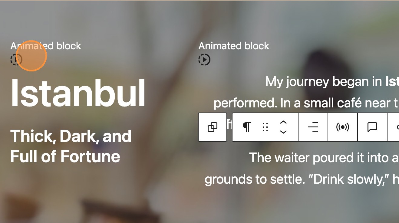
5. Any element that has an animation type selected, will get this animated block tag
Animation settings
When an option is selected, any relevant settings will appear within the sidebar.
6. When choosing fade in, you will see some timing settings appear.
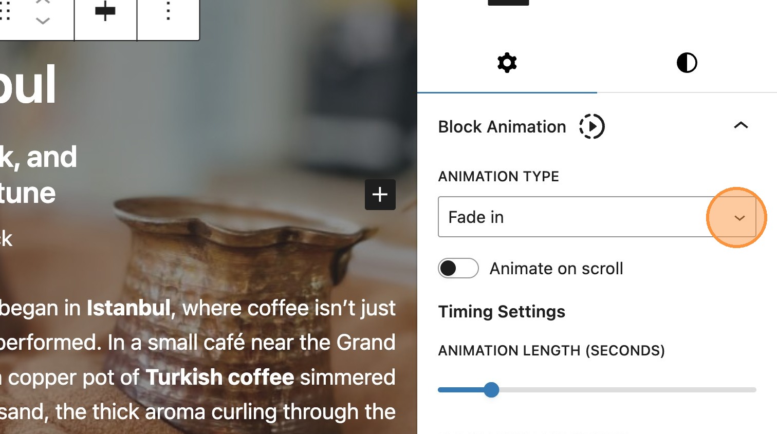
7. Within the timing settings, there are two options. The first is animation length, which determines how long the animation lasts. Select between 0 and 10 seconds.
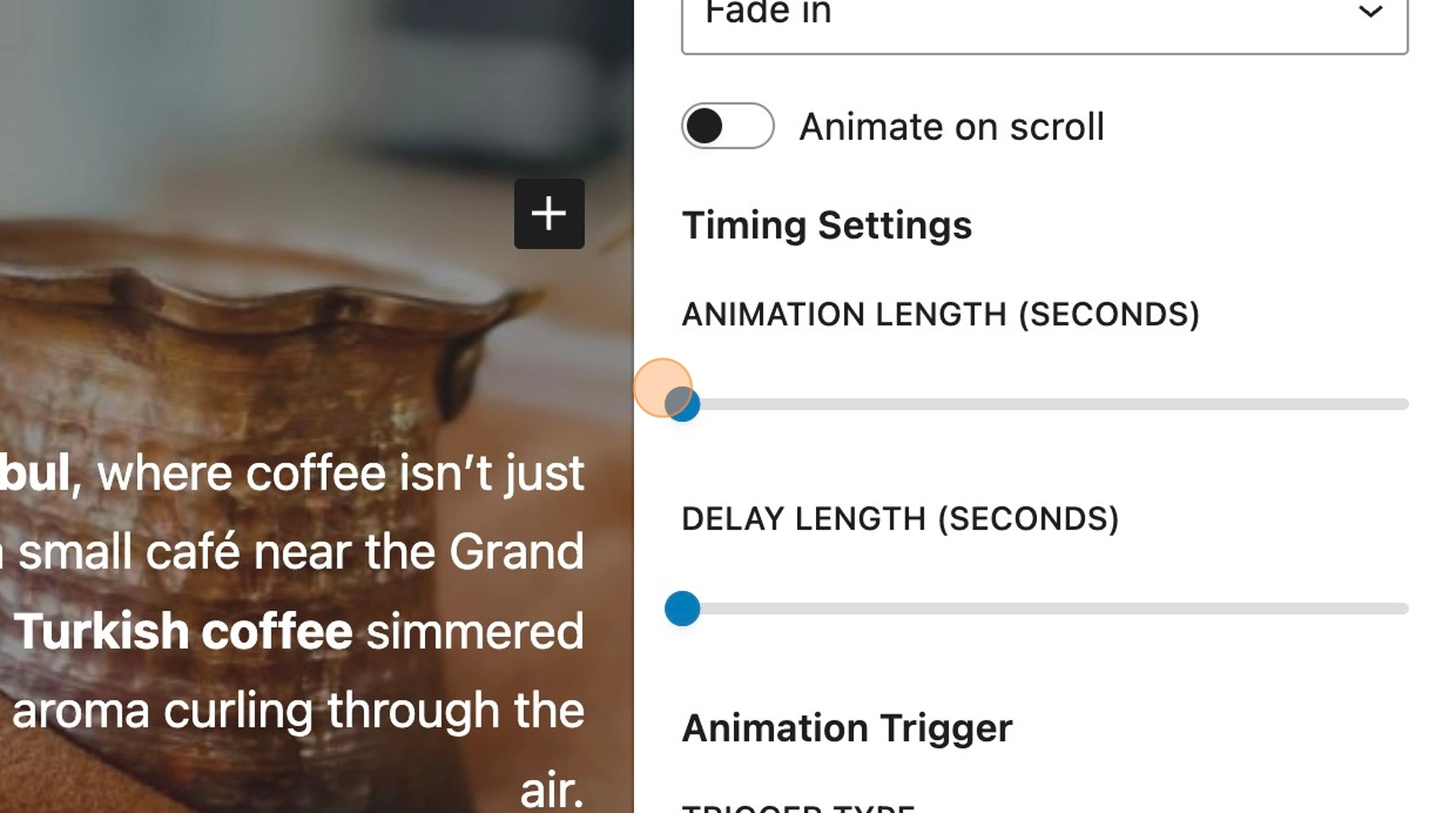
8. Delay length determines the time between the page loading and the animation starting. Again, select between 0 and 10 seconds.
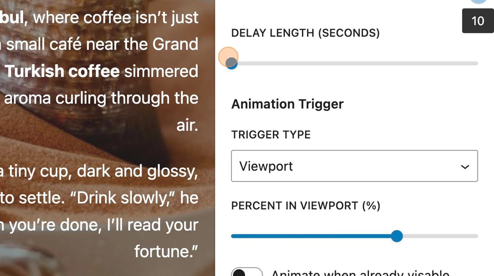
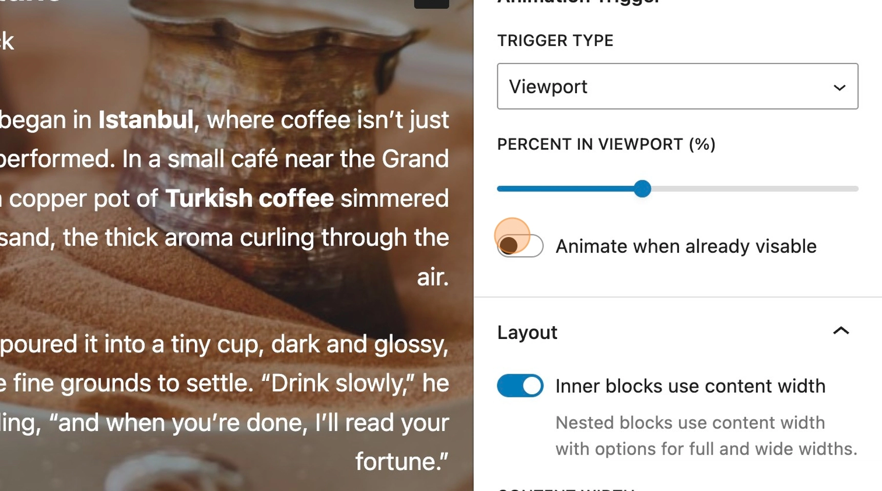
9. The trigger type setting, currently has only one option. The animation will be triggered via the viewport.
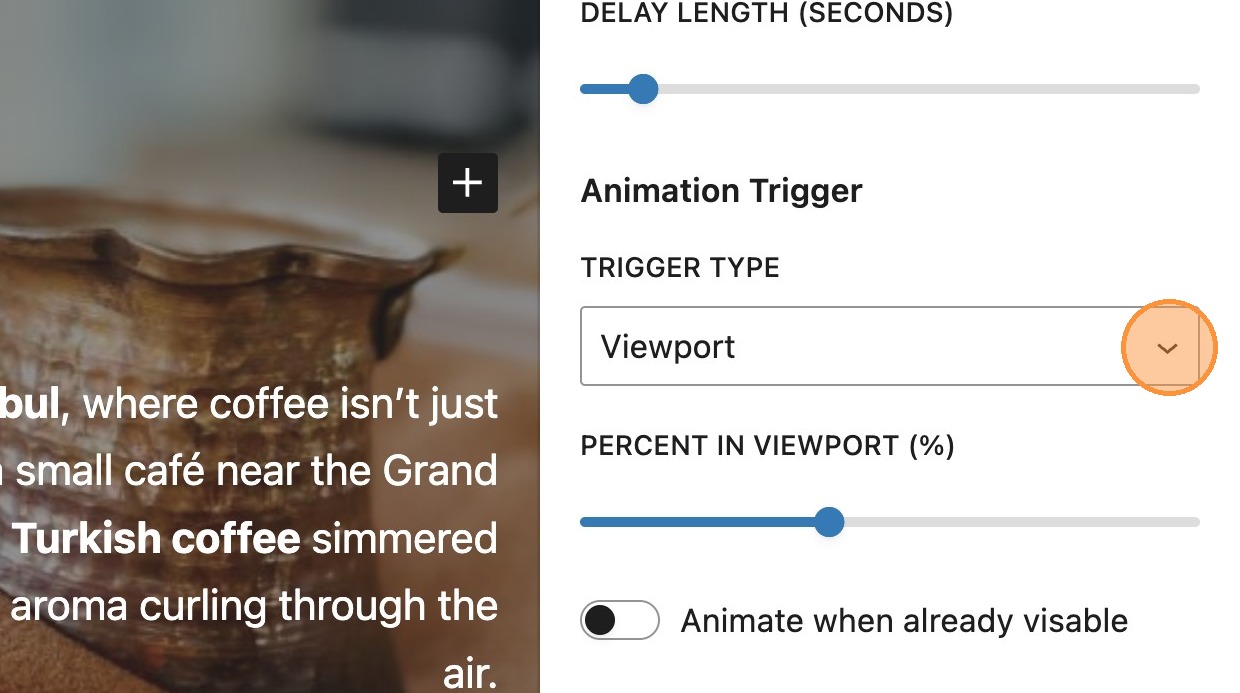
10. The percent in viewport setting, allows the user to define how much of the element should be visible within the viewport before the animation is triggered.
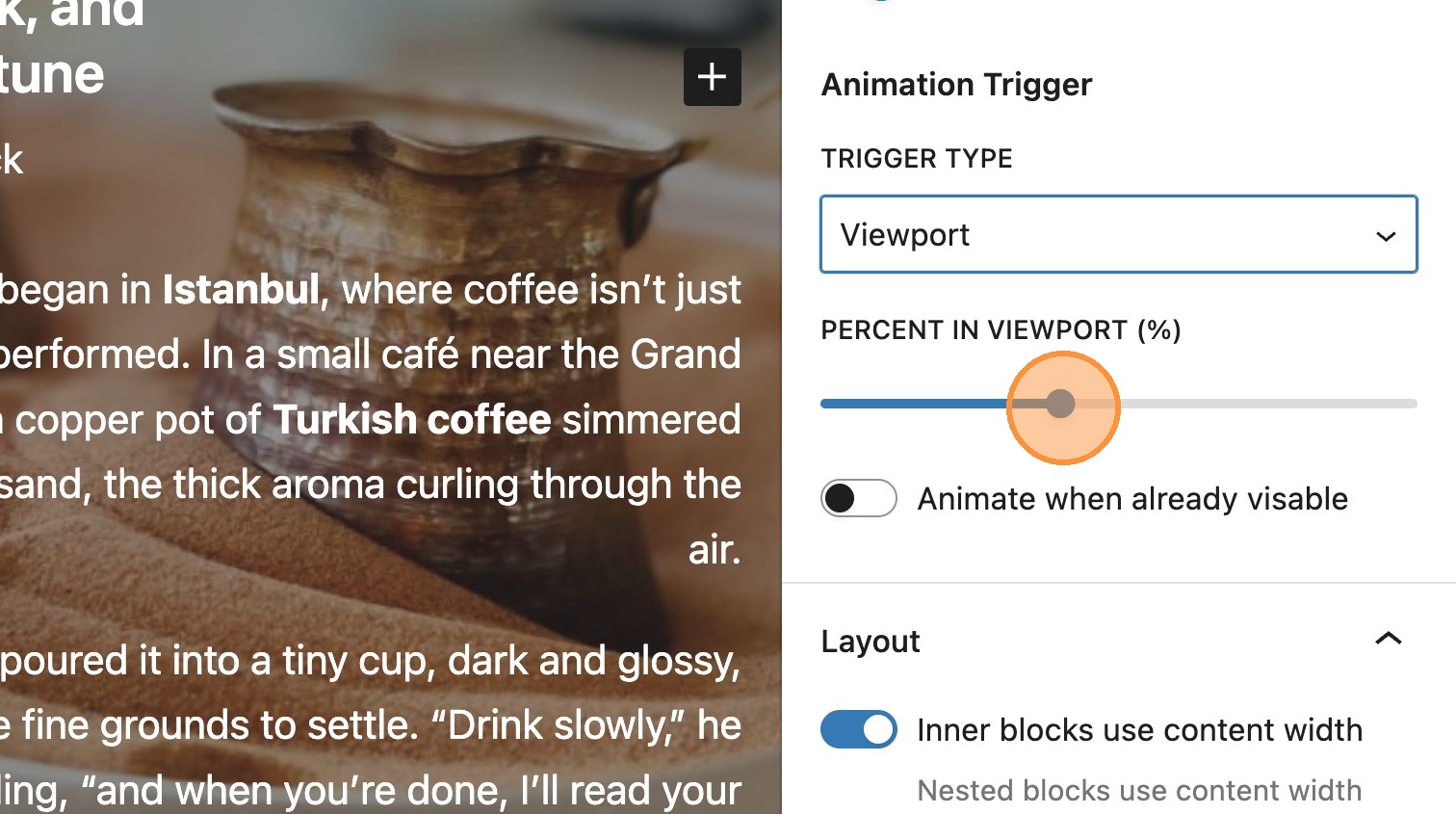
11. Toggling to animate when already visible, allows the animation to trigger even if the element is currently visible on page reload. When this setting is not applied, the element will remain static on the page with any page reloads.
12. You will notice that when choosing either slide in or slide and fade in, some additional slide settings also appear in the sidebar.
The slide in direction option, allows you to choose whether the element slides in vertically or horizontally from a specific direction.
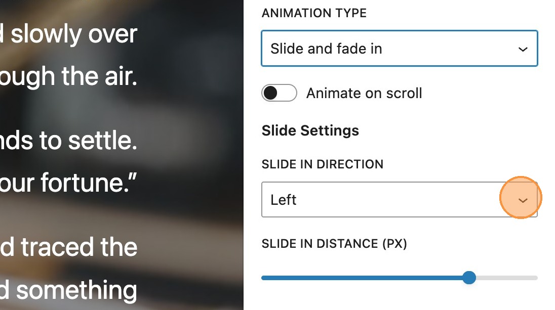
13. The slide in distance determines how far the element slides in from the starting point selected above.
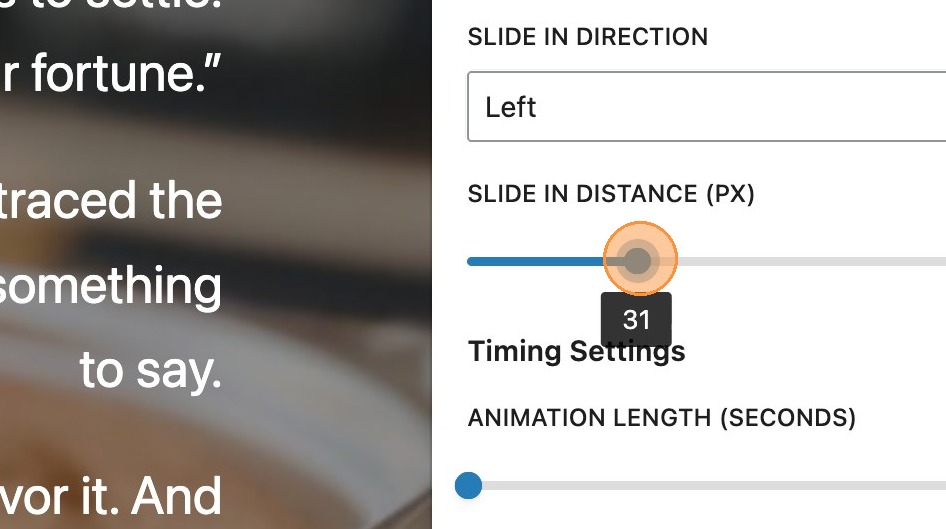

Please note: The slide in distance setting is only applied when choosing to include both Slide and fade in.
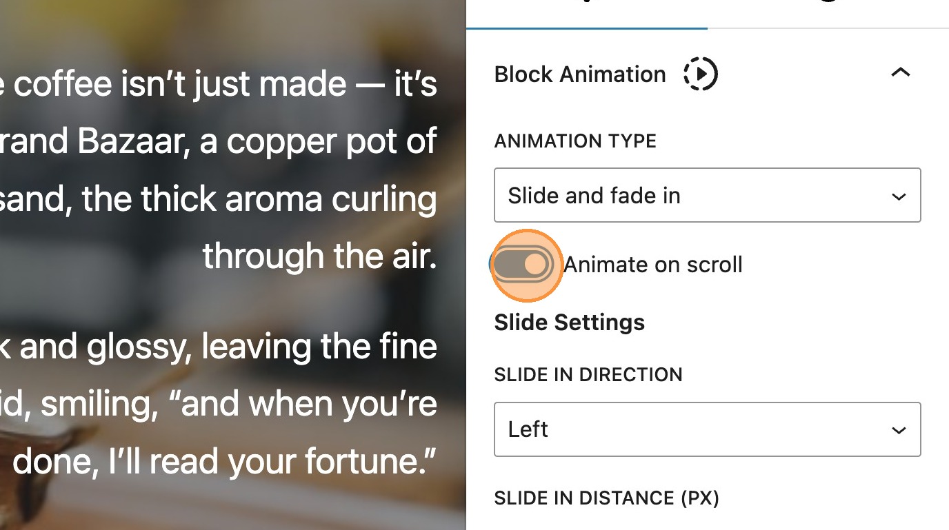
14. In addition to these settings, there is also an animate on scroll toggle. When enabled, this will remove the timing settings as there is no longer a requirement to manually set them. Some of the other additional settings will still remain (depending on the animation type selected.)
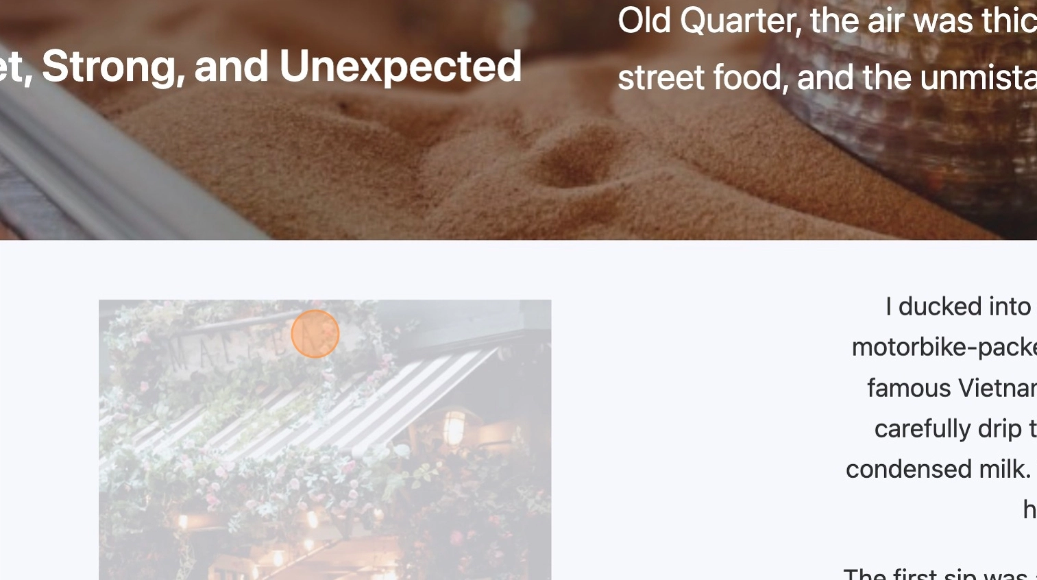
15. The following example demonstrates a front-end element using the fade in animation as it appears in the viewport.
Charts
What are charts?
Charts gives the option to add interactive charts and graphs natively in WordPress. These allow for the use of data which is responsive to hover/click states on the front-end.
16. Once the charts module is enabled you will have access to the charts block in the editor. Within the post or page, search for and add a chart block
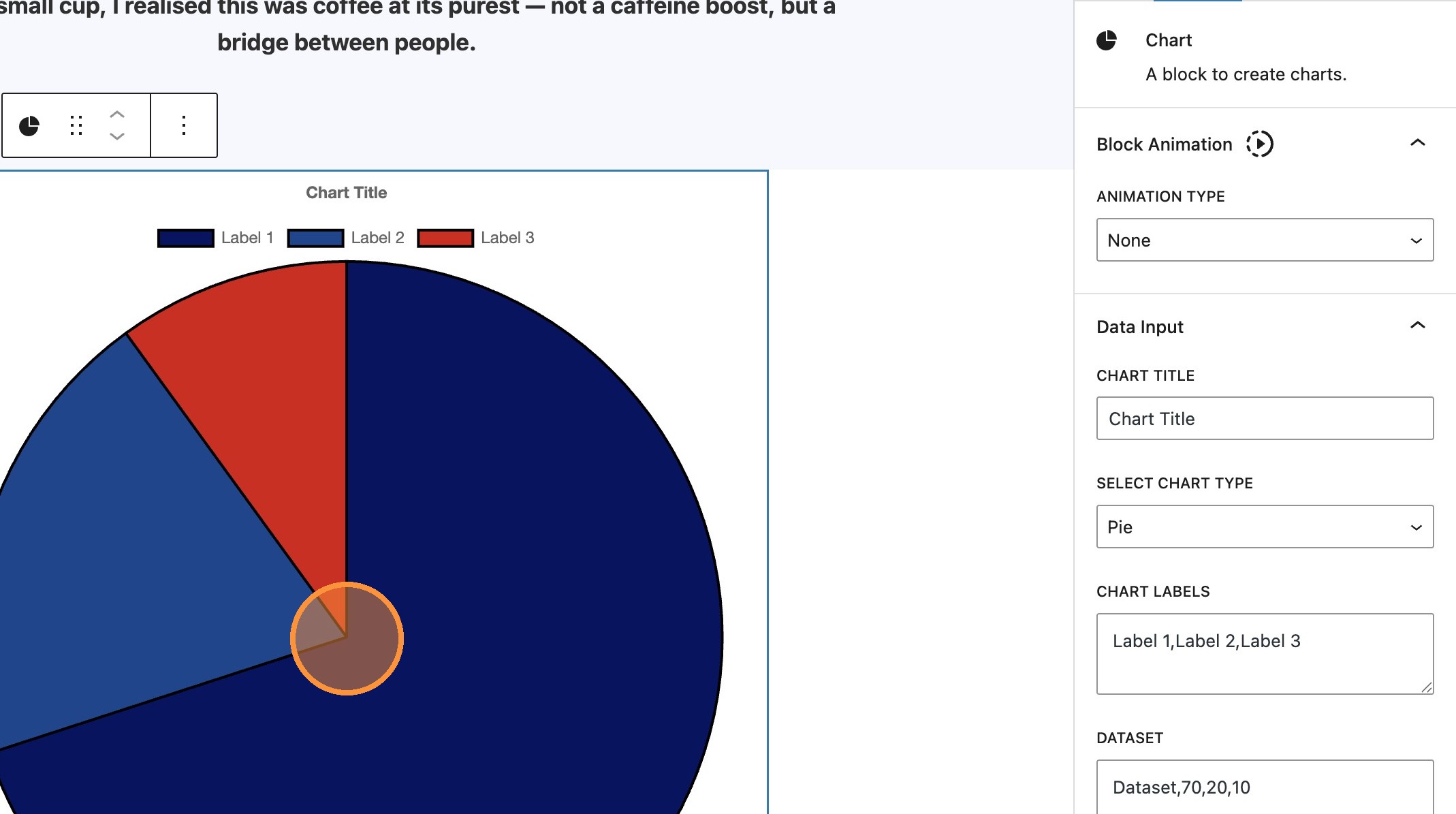
17. There are a number of settings available in the sidebar. Firstly the chart title can be added. This will reflect just above the chart itself.
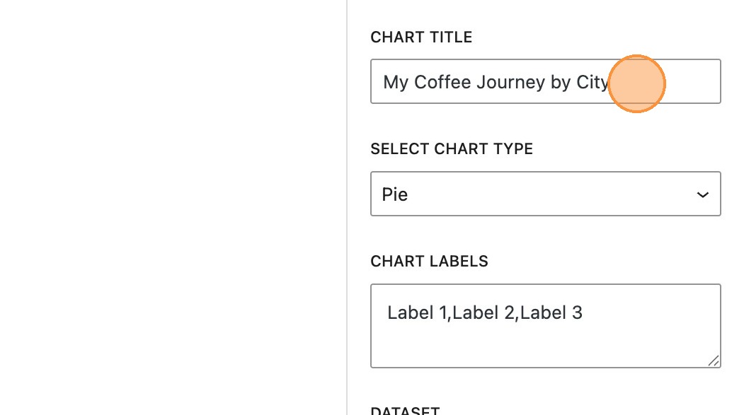
Chart types
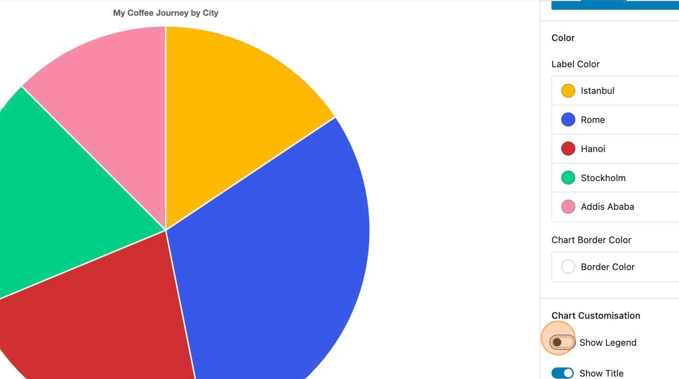
18. By default the chart type will be set to pie and a default set of data will be applied.
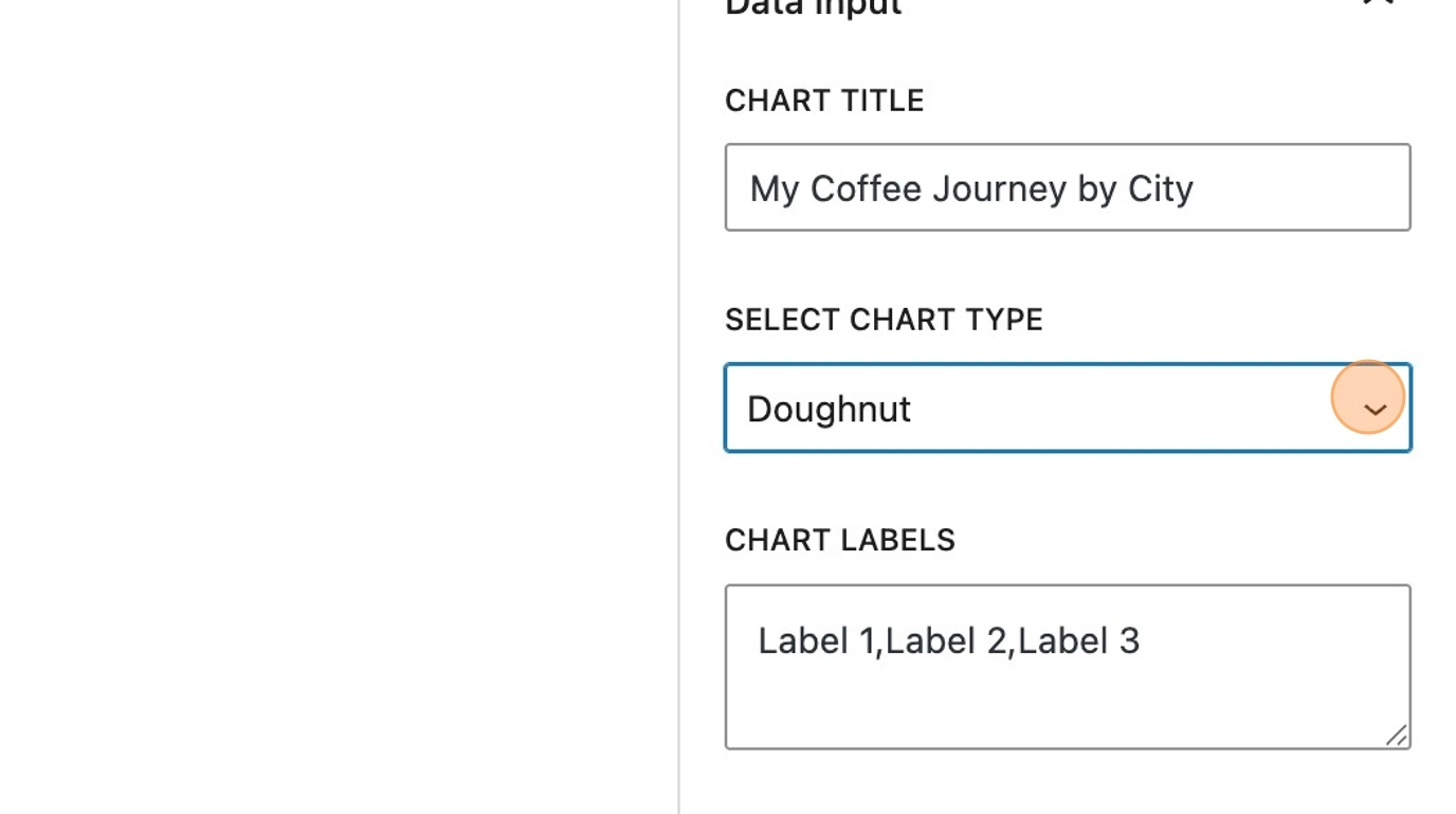
The chart type can be changed by using the drop down in the sidebar. Lets look at the other chart types that are available.
19. Doughnut, similar to pie, this provides a similar layout, with chart labels appearing above the chart itself. Hovering each section will show the dataset.
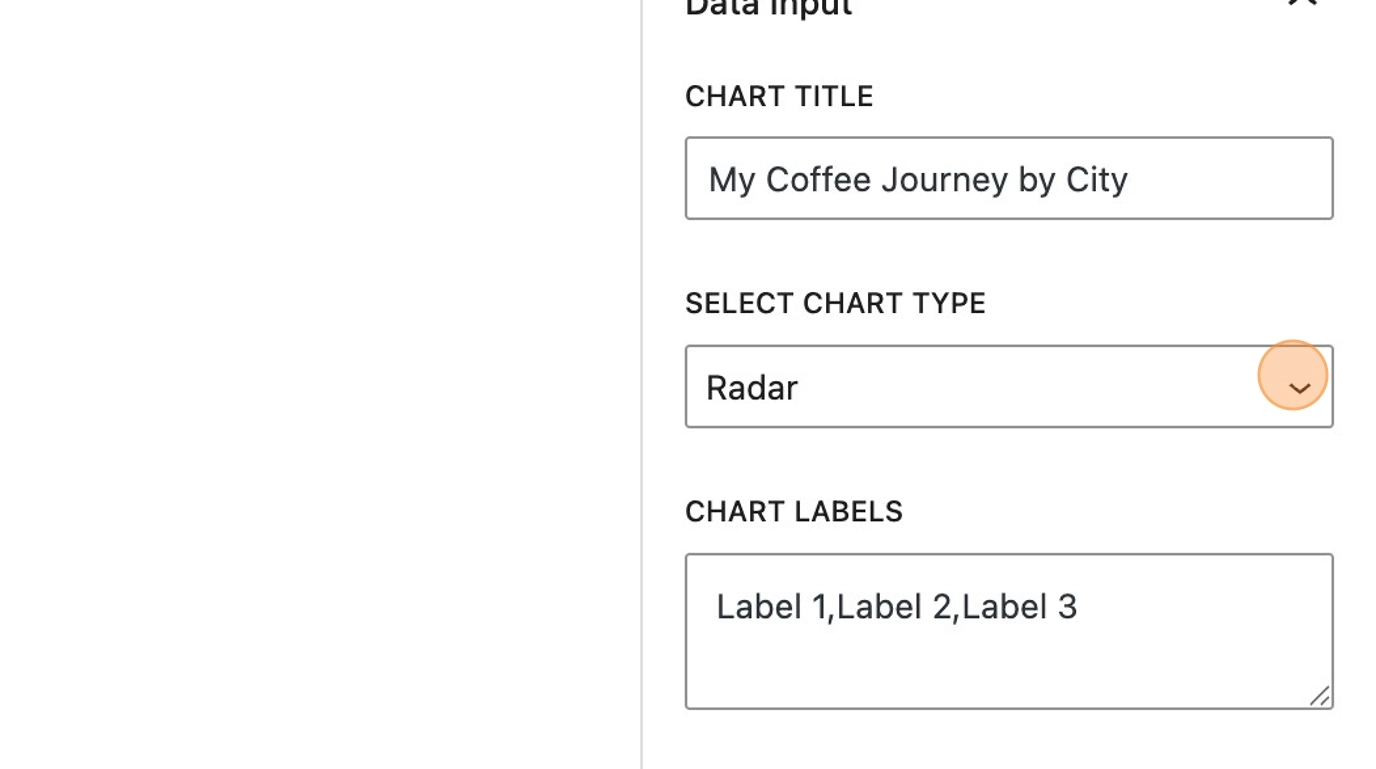
20. Radar, shows an alternative view of the comparison
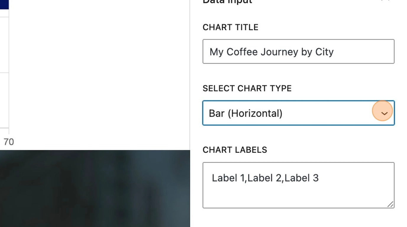
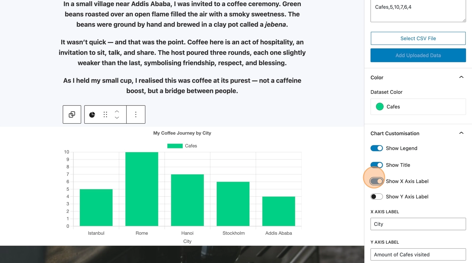
21. Bar, can be set to either horizontal or vertical and shows each dataset on an X and Y axis. This time the name of the dataset is shown above the chart, instead of the labels for each section.
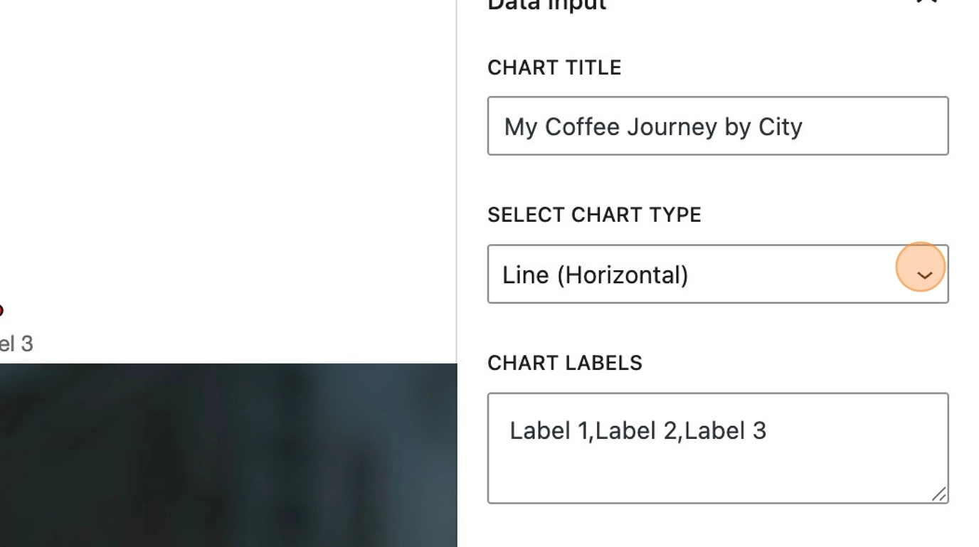
22. Line, also can be set to either horizontal or vertical depending on the requirement or layout. Again, the name for the dataset is shown above the chart.
Editing the chart data
23. The chart labels determine the content for each section or point on your chart
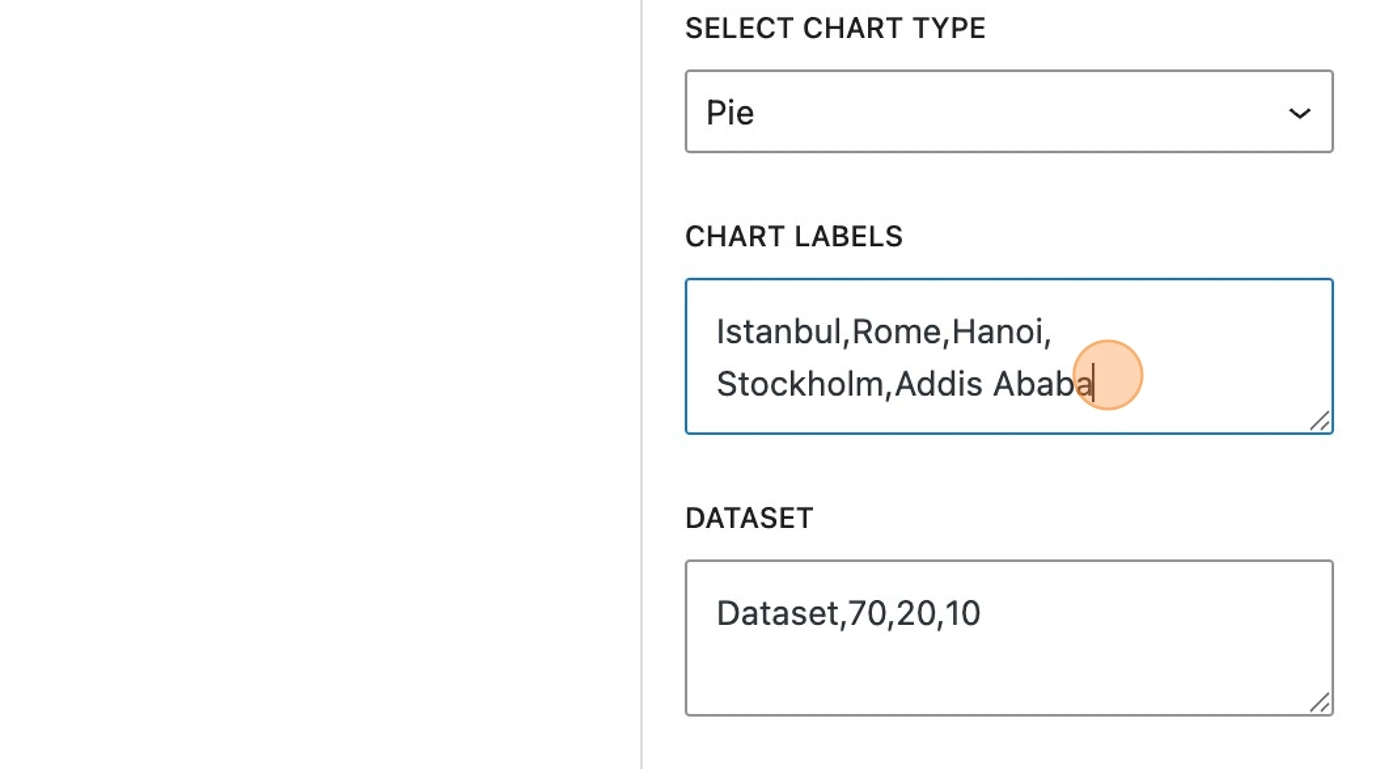
24. The dataset should include a name that represents the data, followed by the data itself. Separated by a comma, the chart will automatically update with the data input and display in the order it’s written in the sidebar.
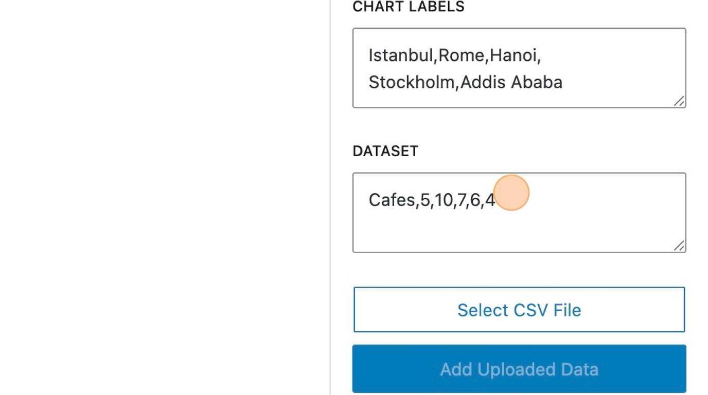
Please note: The order in which the chart labels are entered, corresponds with the order of the dataset values.
Styling a chart
25. It’s also possible to add some styling to your chart, via the colour panel. The label colour can be altered depending on the needs of your design or theme. Depending on your chart type, you will also have options to change the colour of the dataset (bar, line and radar) or chart border colour (pie and doughnut).
Click here.
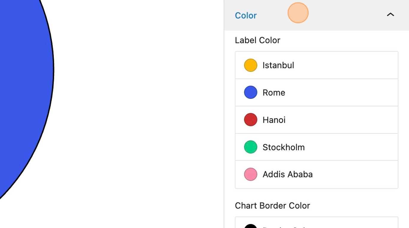
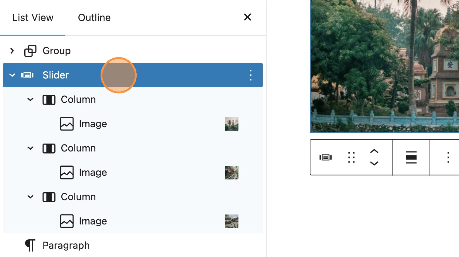
Chart customisation
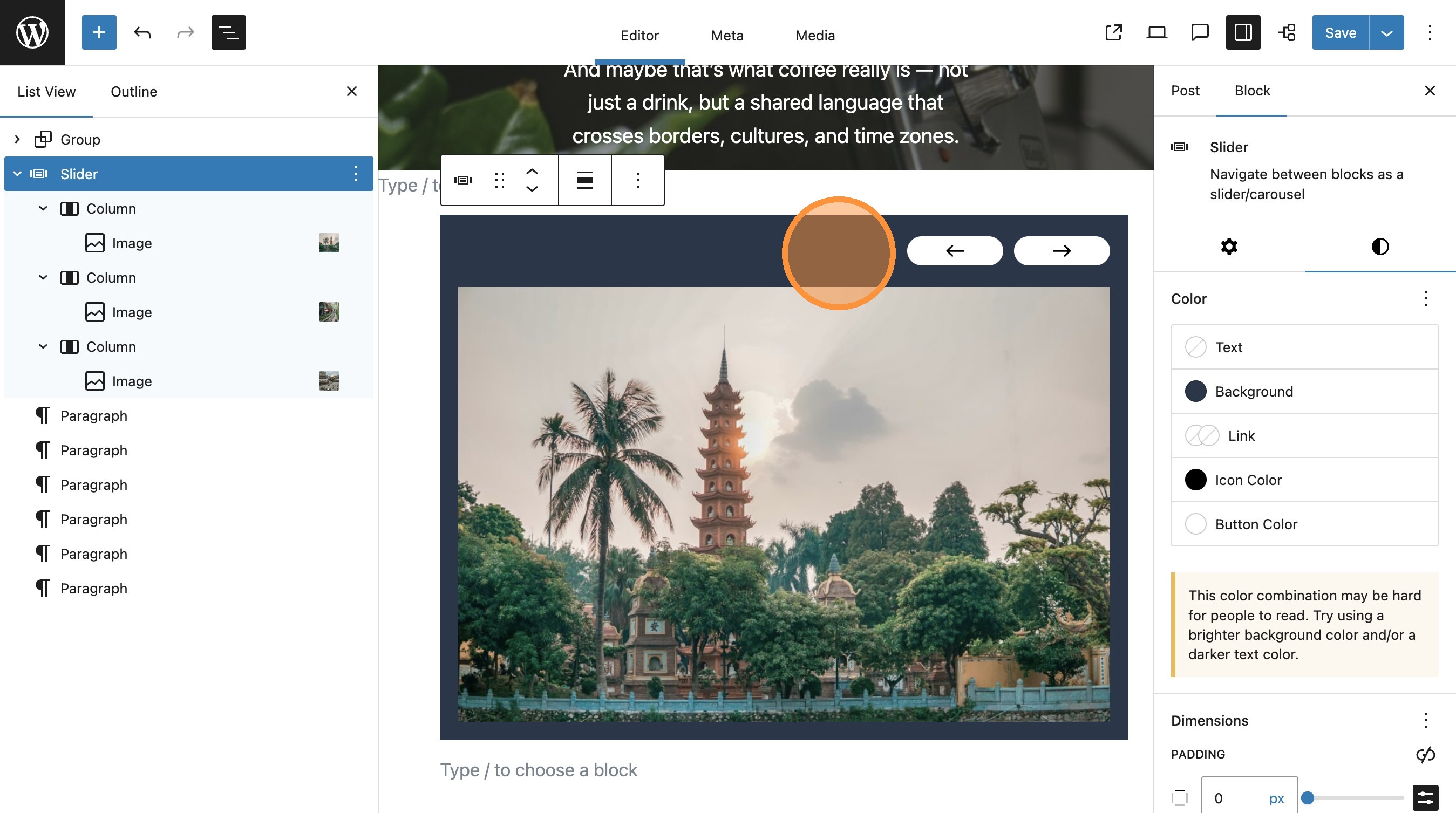
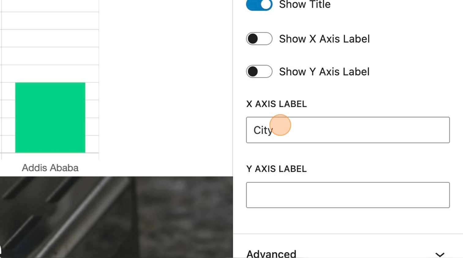
26. The chart customisation panel gives you some additional settings depending on your specific requirements.
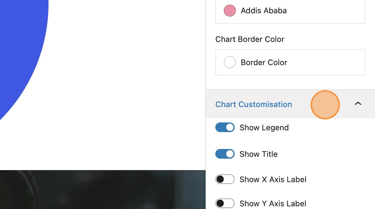
27. By default, both the title and legend are visible, however its possible to toggle each of these off independently.
28. It’s also possible to add labels for each of the axis.
29. Depending on the chart type, you can then toggle these on or off.
Importing existing data
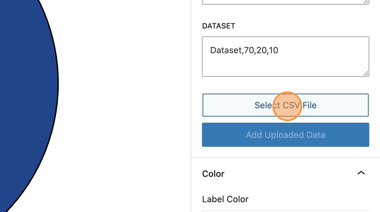
30. It’s also possible to import data using a [[.csv]] file.
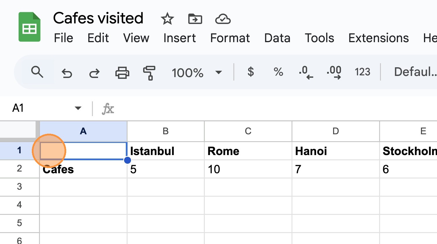
31. Importantly, the data in your [[.csv]] file must be in the correct format. This will ensure that when imported, the chart labels and dataset values are retrieved correctly.
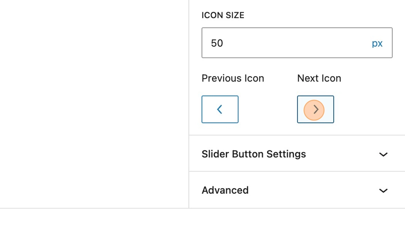
The screenshot below shows the expected format with required labels set as column headings, and the dataset name as the row header, with appropriate values under each label.
32. Once uploaded, select Add Uploaded data, to import your data into the chart
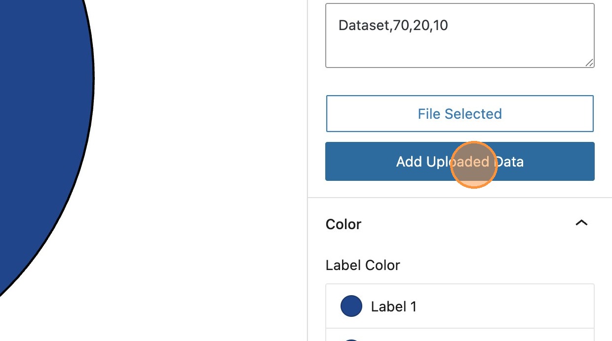
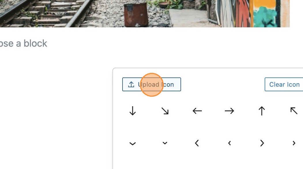
Image Comparison
What is image comparison?
33. Once you have enabled the modules in the MediaPress Blocks settings in the dashboard, search for and add an image comparison block.
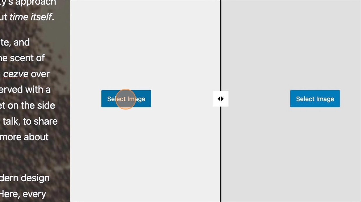
34. With your block in the editor you will see the option to select the images. Select your first comparison image from the media library. Repeat the process for the second image. You should then see your two images side by side in the editor.
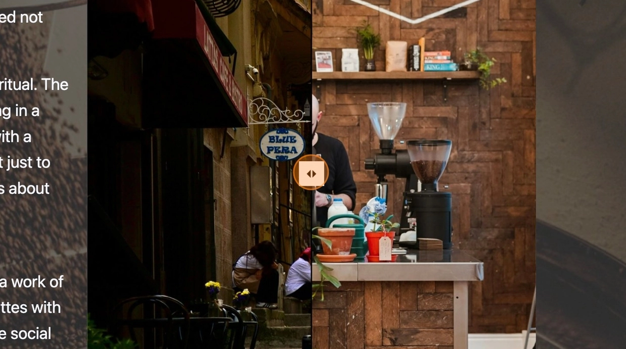
35. Save and view your post to view your image comparison on the front-end. You will see that you can move the slider from left to right to view and compare each image.
Block settings
36. There are a number of block settings available in the sidebar.
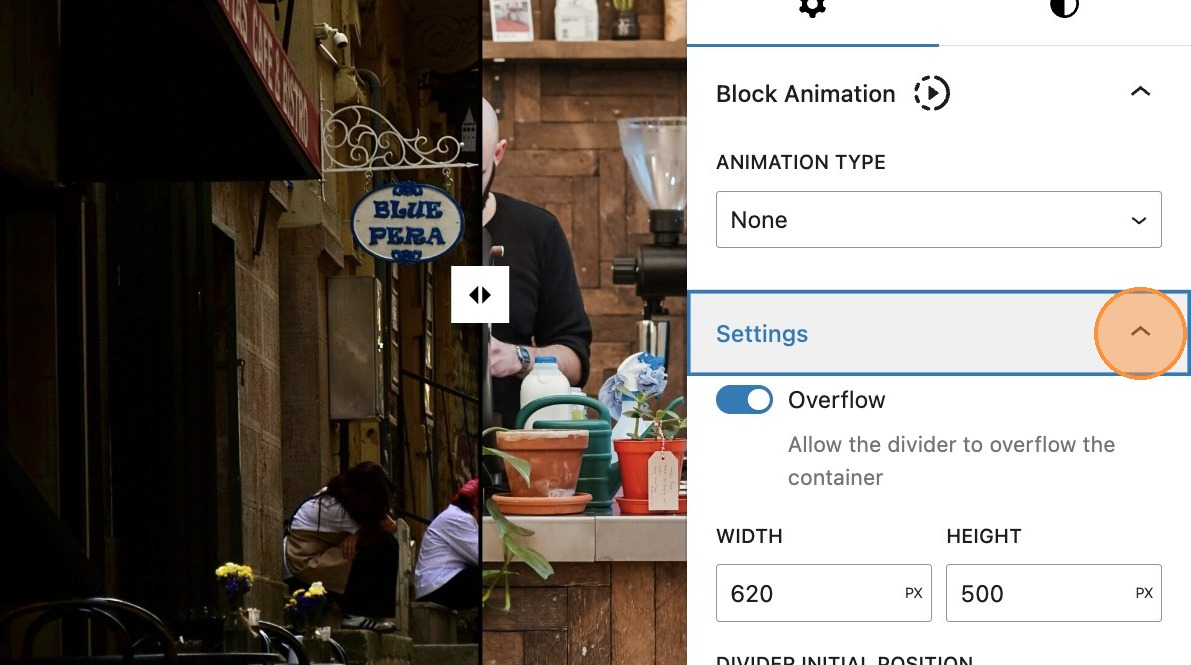
37. By default, overflow is enabled, however if you toggle this off, it will not allow visibility of the slider handle on the front-end should it overflow the image.
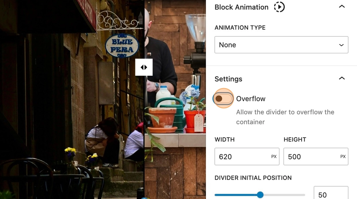
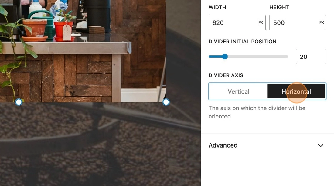
38. The height and width of the block can be altered here, depending on your requirements.
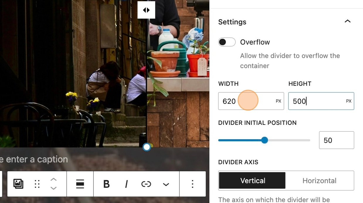
39. The divider initial position slider, dictates the starting position of the slider on the images.
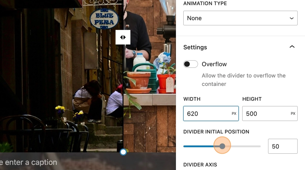
40. It’s also possible to change the orientation of the slider from the default of vertical to horizontal. This would largely depend on the size and orientation of the images that have been used.
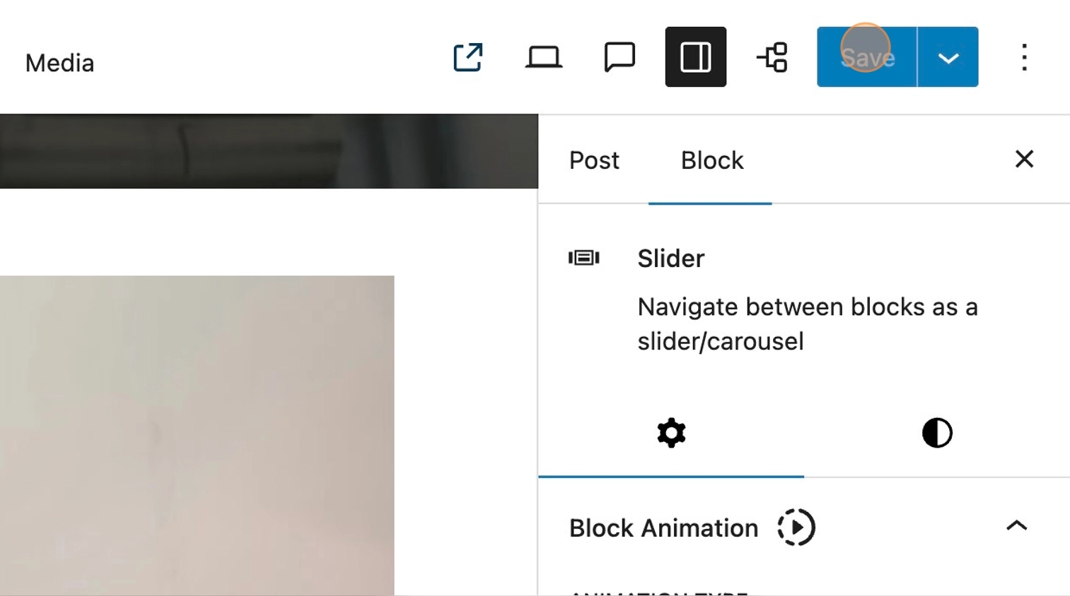
Slider
What is the slider?
41. Enabling the slider module in MediaPress settings, will allow you to create a sliding gallery of images which includes formatting options to suit your needs.
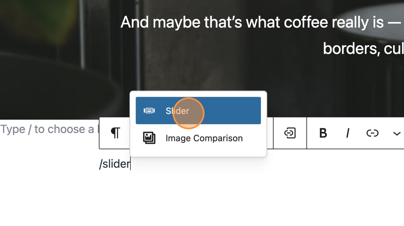
42. On your post search for and add a slider block
43. Essentially the slider acts as a container, with previous and next toggles. This container will hold a number of columns. In this example we will add images to create an image carousel, however in essence any block could be added within the slider.
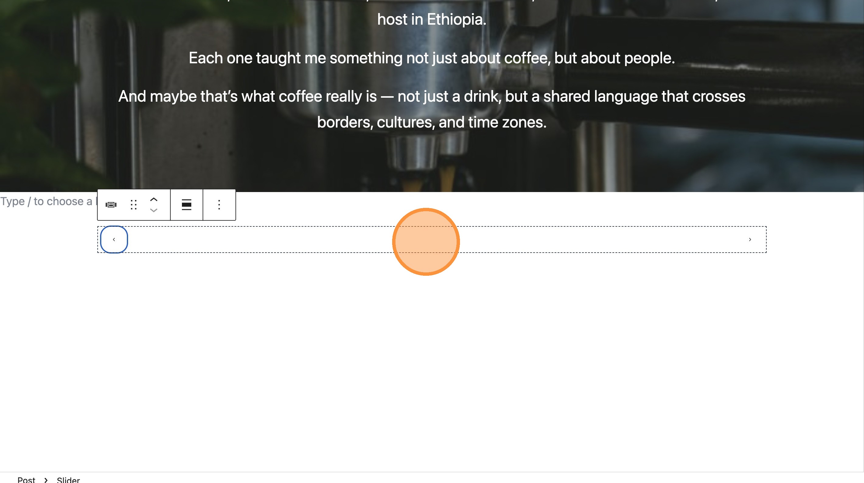
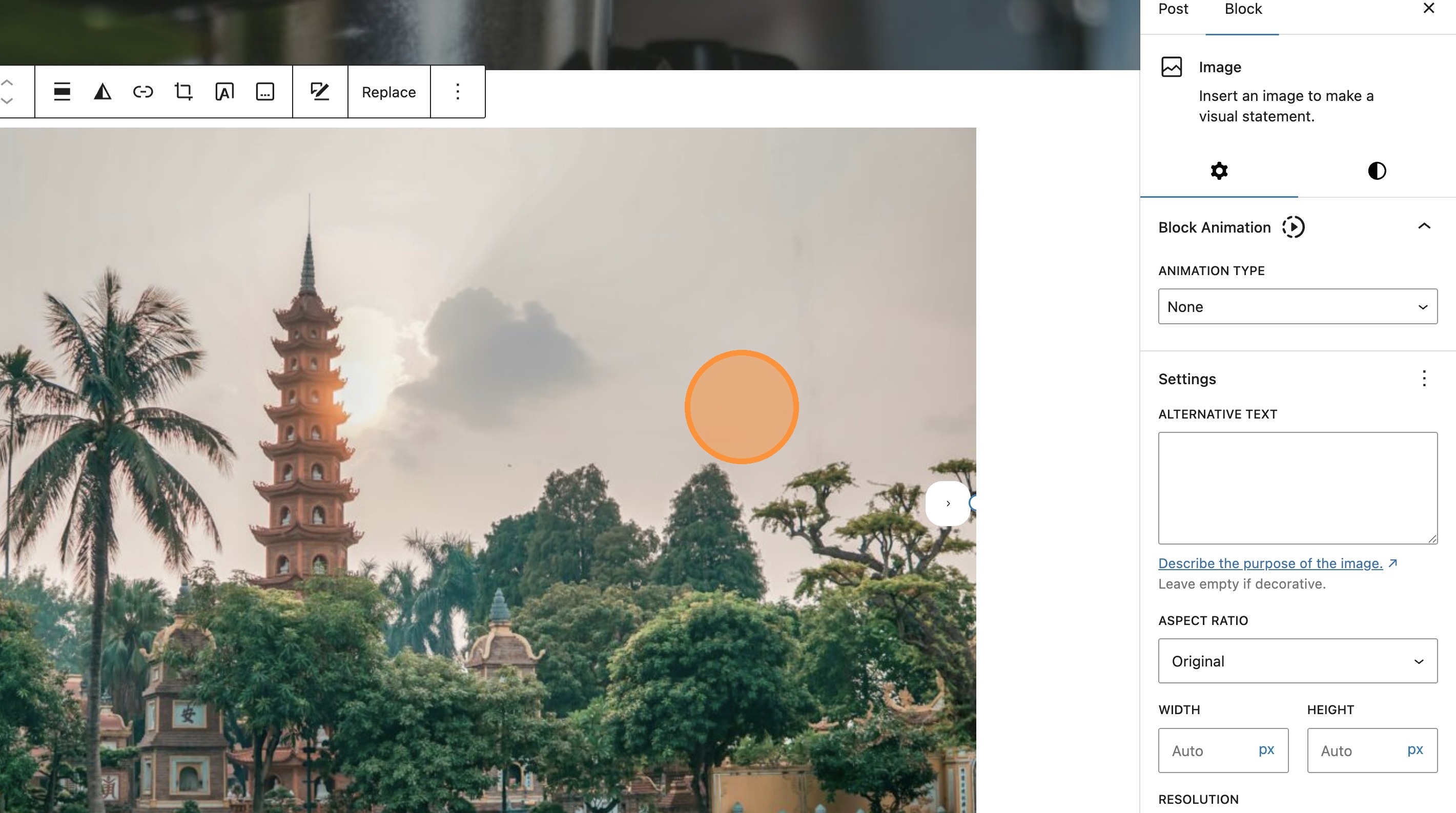
44. Add your first image in the standard way.
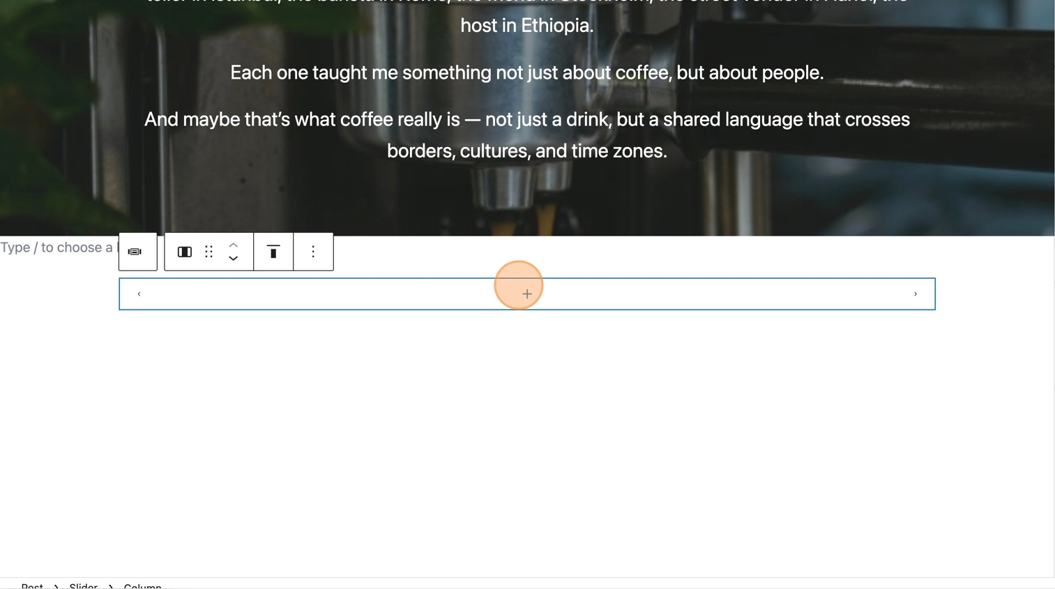
45. Your image will be added with the previous and next icons becoming more visible.
46. By default the block comes with 3 columns.
47. Clicking the next icon will show the next column where you can add your next image. Repeat this process for the third column.
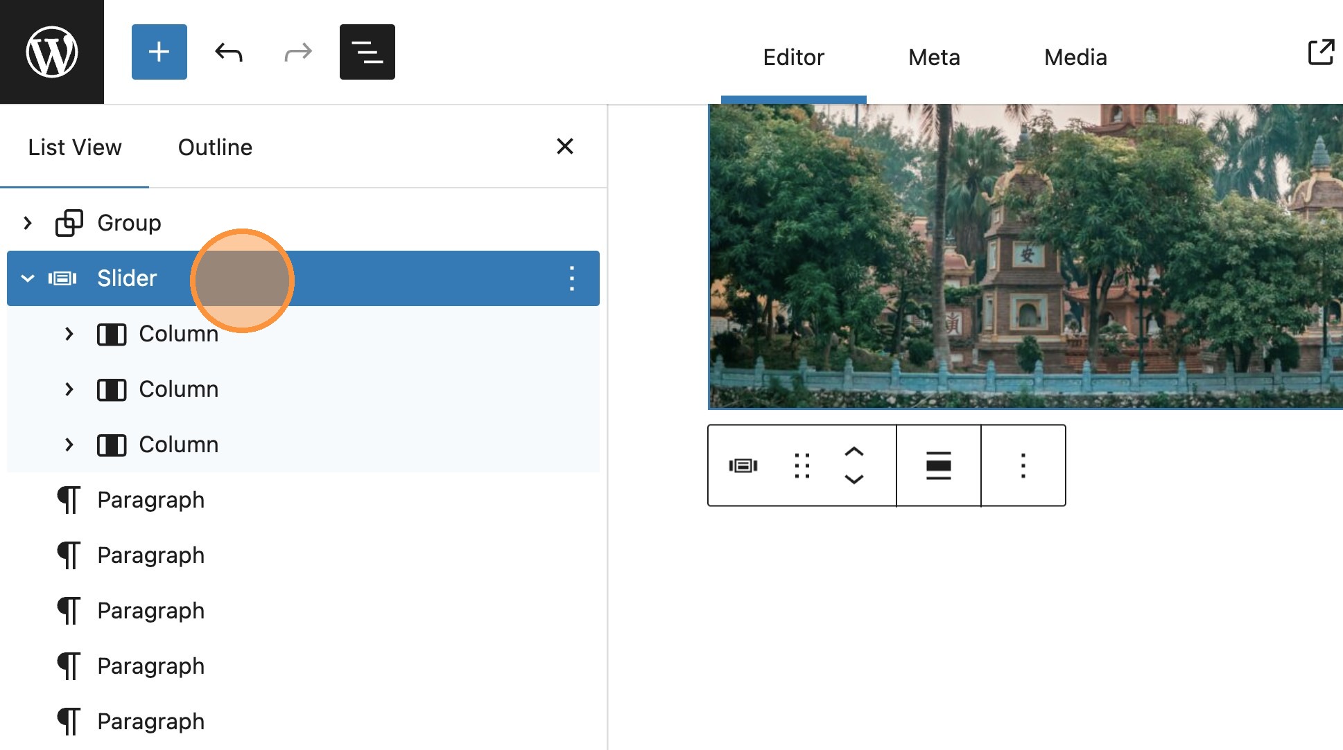
48. You should now see all three images inserted. You can see this here in the document overview panel.
49. Save and view your post. You should now be able to navigate between the images in the carousel.
Slider layout
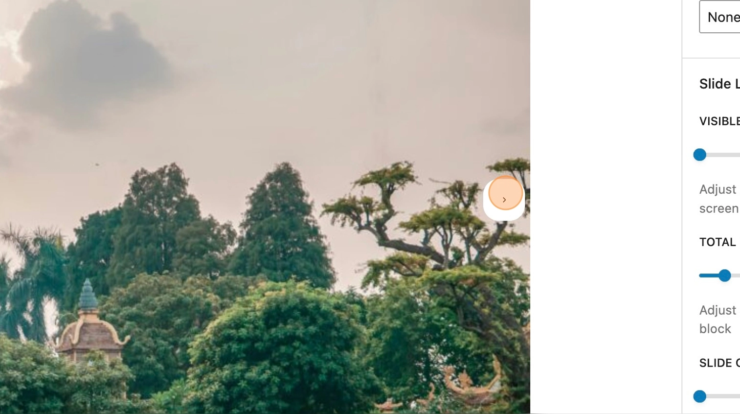
50. Within the sidebar, it’s possible to increase the amount of visible slides. By default this will be set to one, however you may wish to increase this depending on your requirements.
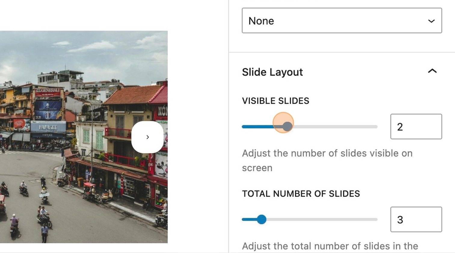
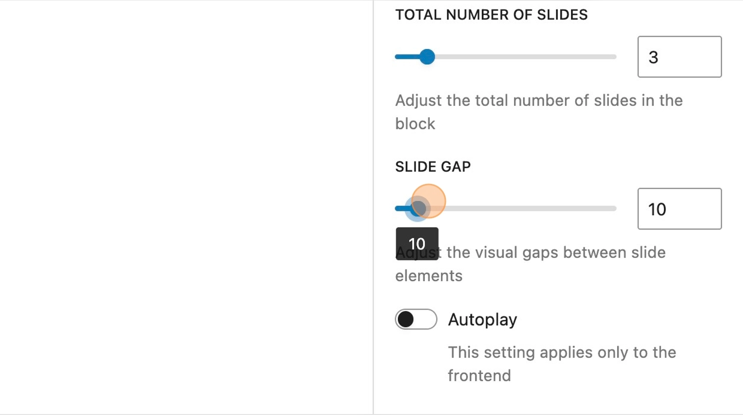
51. It’s also possible to increase the total number of slides (columns).
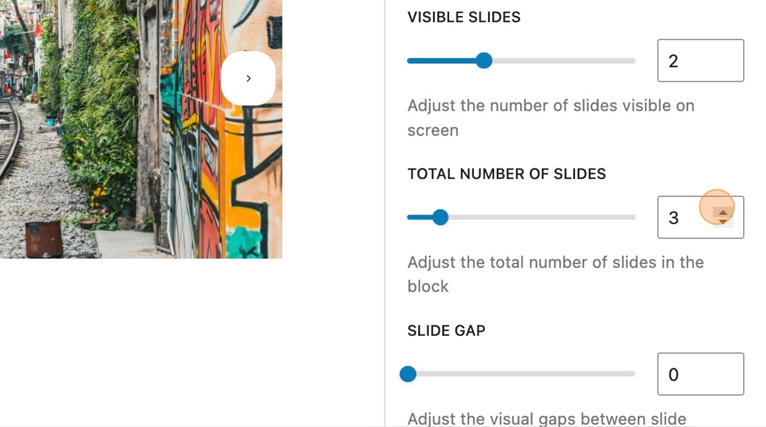
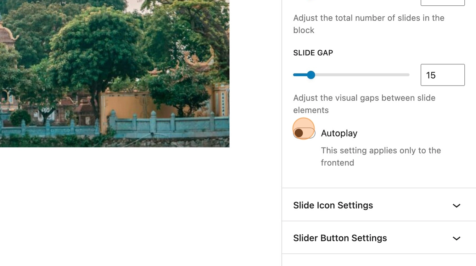
52. When the amount of visible slides is set to one, the gap between slides can be increased.
53. By default, the slider will require the user to manually select the next image in the carousel by clicking the navigation buttons. However the autoplay toggle enables the carousel to automatically scroll when viewed on the front-end. The autoplay speed can be adjusted, depending on preference.
Icon settings
It’s possible to personalise the styling further by altering both the button styles and the icon itself.
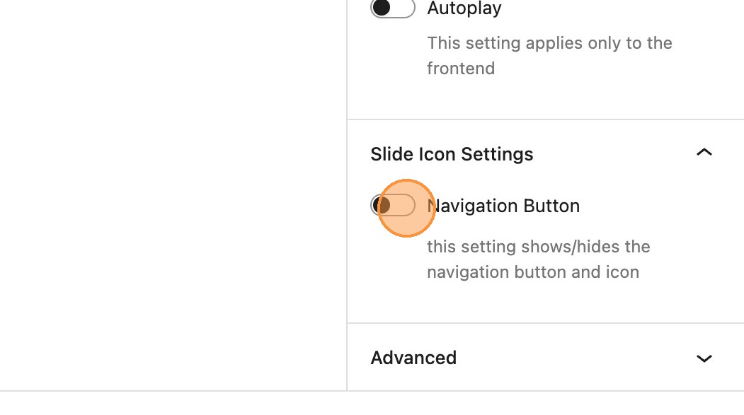
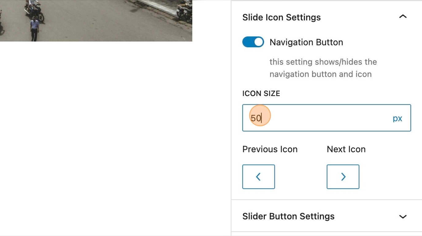
54. Within the slide icon settings the first option is to toggle the navigation button on or off. This is ideal when using the autoplay feature.
55. When visible, the icon size can be increased.
56. There are a range of different icons available for the buttons, should you wish to change these.
57. There’s also the additional option to upload your own icon.
Button settings
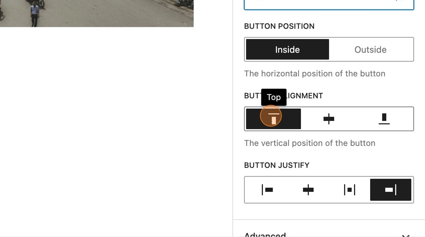
There are a number of possible styling options for the button itself. In this example we are going to start by aligning the buttons in the top right of the slider, as shown below.
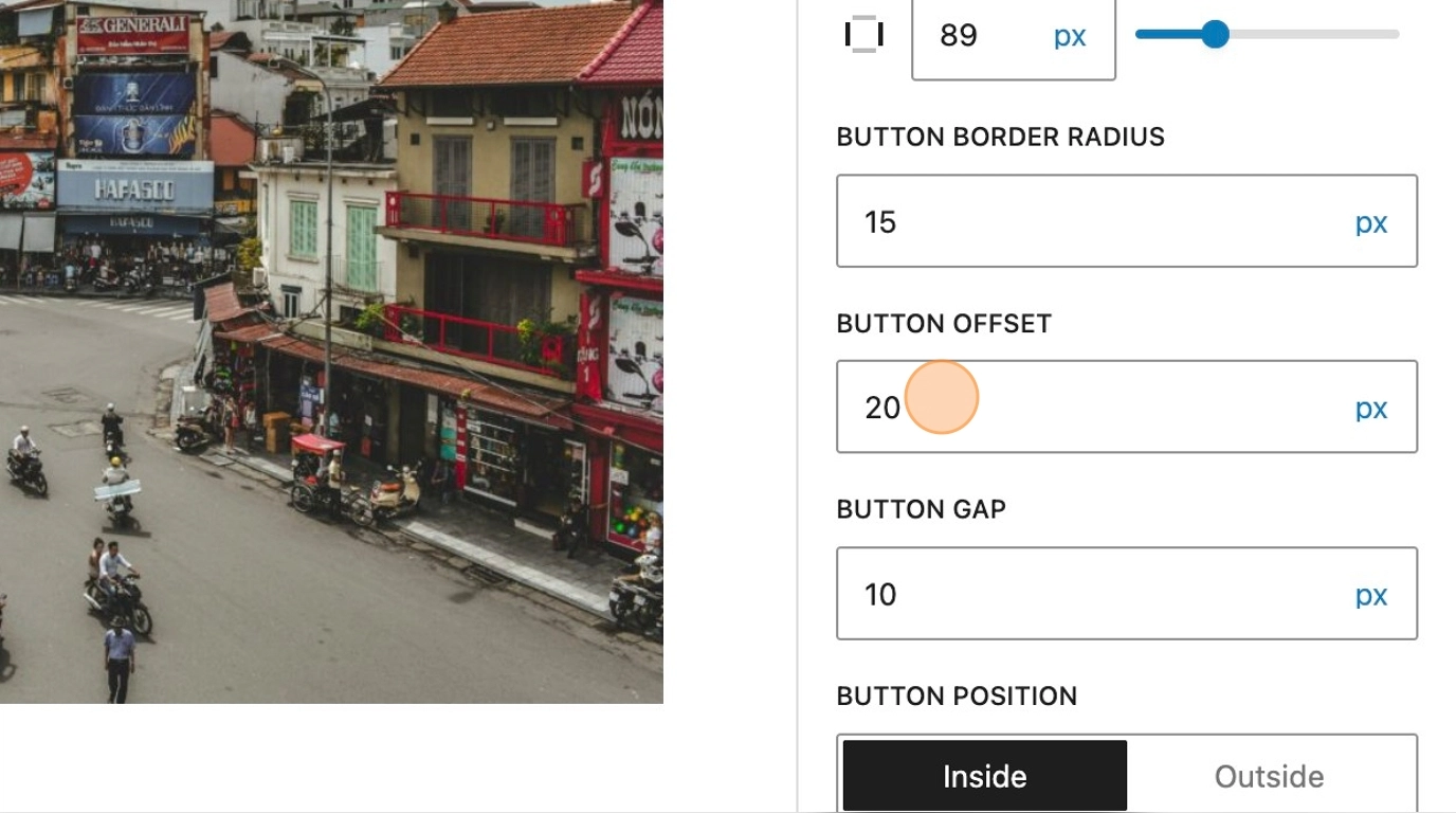
58. We’ll then add some horizontal and vertical padding, to increase the size of the buttons, along with an increased border radius to round off the edges.
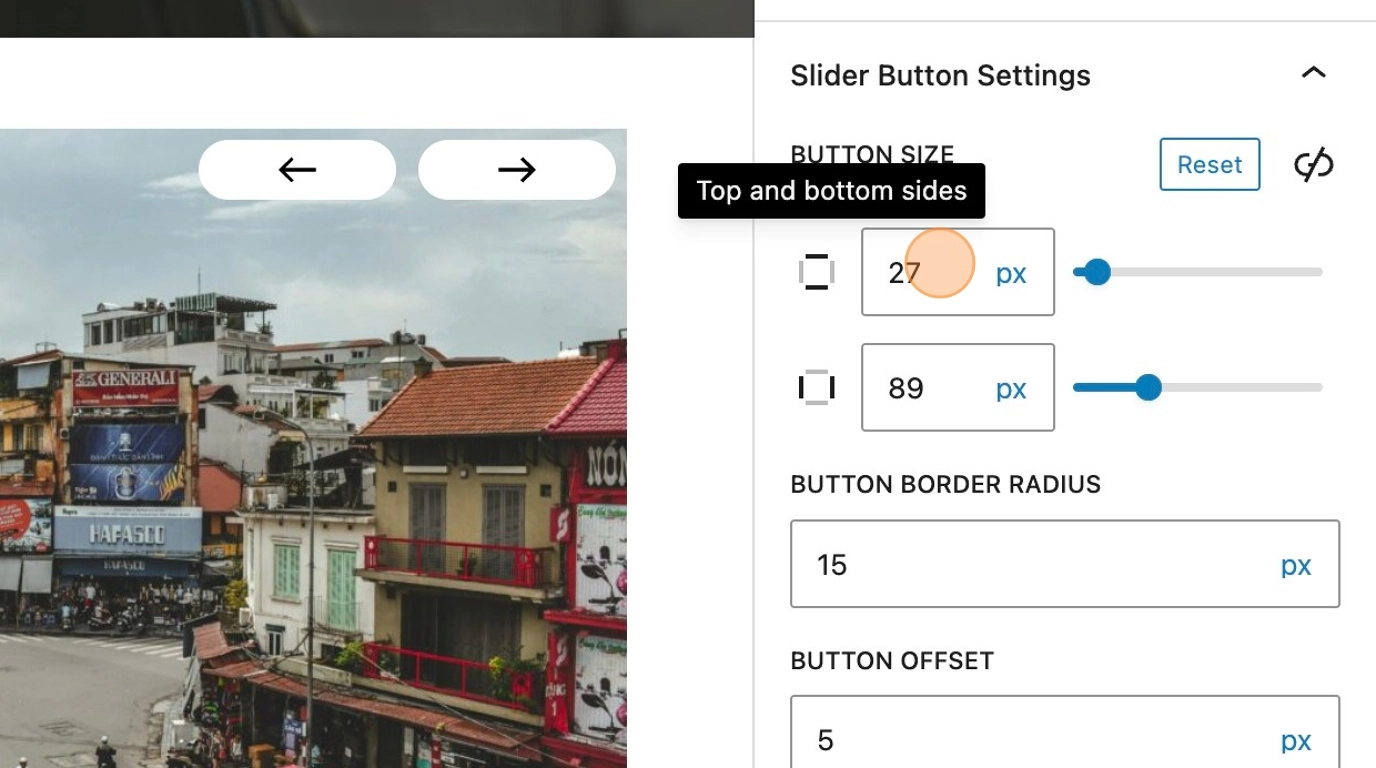
59. Increasing the button offset setting, will increase the distance between the edge of the slider. The gap between the buttons can also be increased to suit your preference.
60. The final setting, allows you to move the buttons outside of the slider.
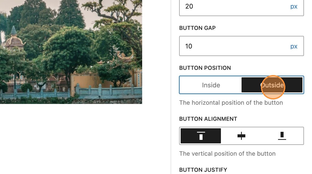
61. Along with some additional styles to the parent slider block, you can create an alternative slider appearance.